
Week Number & Date: Week 3: 24/02/20 – 02/03.20
List of Tasks planned for this week:
- Start off with environment design, include silhouetting, colour ideas, sketches, detailed paint tests and thumbnailing of scene.
- Get up to thumbnailing by the end of this week (Environment must be done by 9th March according to proposal)
I have decided to work on my environment design first to get into the swing of things. I’m starting a little later than most people since I spent longer on research than I usually do to get a better understanding of the theme.
Starting off the ideas generation can be the trickiest part since a lot of the time you don’t know where to start. The way I tackle this is by doing what I call “ideas vomit”, I do this by just putting random unstructured sketches down and doing this until good structure and ideas are formed. If you look through my work it becomes more structured over the course of time here. I did basic test pieces and ideas for leaves, flowers and branches here. I created these pieces using a pencil and a fineliner pen. There were just initial sketches and doodles to understand how it can all look. I played around with the shapes of leaves, flowers and branches. I let loose with the shapes to create a more natural and free flowing look. An issue I came across was not being able to get texture in or being able to see how it would look in the painted style, so I went and took these into photoshop afterwards.
With the leaves I drew them coming from branches, this was done to just understand the flow of how that can sit, look and grow on the branches. I used my pinterest board for reference to understand how they grow off branches. On top of this I looked into things like nuts, berries and flowers growing from the branches, I think these small details like the berries and flowers would be good since they could break up all of the green in the leaves so it isn’t over whelming.
t

I then moved onto flowers, I knew the types of flowers in my environment and the ones growing out of my creatures had to be types of flowers you can find in the woods (not incredibly tropical) I looked into flowers like tulips, chamomile and snowdrops. These are just “ideas vomit” so of course they aren’t perfect, it’s to just get me into the flow. I also looked into how flowers can grow from branches in a little more detail; My mum told me about magnolia flowers so I decided to look into those and do a quick sketch of them, I really like how these have all turned out, of course I will be able to put more detail in when I move over to photoshop next. These have given me a good idea as to what I need to consider and do when painting my flowers.


As these were just test pieces I quickly painted them over a grey canvas to bring out the colour. I applied the base colour and marked out the structure with a darker shade so shading could be added around it. I was able to build up tone and details this way. I find this way of painting very relaxing and satisfying. Because this was a more refined test I used my flower photos as reference to help me understand how flowers work to help me create good test pieces.


Doing my flowers digitally really helped me visualise on canvas what my flowers could look like potentially in the final product! The snowdrops didn’t turn out great, it was the first one I did; For me art is like pancakes, the first attempt will always fail like pancakes and then it will get better over time with more attempts.
I tried out giving some of the pollen a fairy like glow, I feel like the blue flower is a little too much, it’s a nice contrast but feel like I should have lowered the opacity. I think it worked well for the pink flowers since I made sure it was subtle and that it didn’t override the flowers. 
I then moved onto tree and leave test pieces, I had done some initial sketches of some branches and leaves so I wanted to see what they would look like digitally, something that I knew I needed to figure out was how the leaves would sit on the branches in the scene, Something I really want to achieve is an environment that is a little more detailed than I usually make them. I want the leaves to actually look like leaves here and to have clear form, instead of the usual blobs I do for the leaves. I used different toned leaves and buds to build up tone and depth in the branch, I really liked how it turned out here, an issue I have however is the fact that it looks bare, it doesn’t feel like there are enough leaves here.

I got around this issue by duplicating the layer of leaves, increasing the size, changing the position and darkening the layer, I think it turned out really well here, I think it layers up in a natural way here and they all look like they are coming from the tree. I do still think it looks a little bare here, none of the branch is properly covered so I’ll sort that out.

I duplicated the layer of leaves again, this time I made the leaves lighter, I shrunk them and put them infront of the branch, at first I was worried it looked too busy and overwhelming but my art tutor reassured me that it was fine, after this I began to really like how this test piece turned out. I think the three layers on leaves really build up the branch really nicely here. The way I have painted the leaves and layered them up reminds me a lot of the instagram illustration style a lot of artists use in their work now, it’s usually quite simple shape wise and is layered up with various tones to create depth, I really like this.

I prefer the detailed leaves I have created over the bloby leaves I used to do in my art, here is a comparison, I do however feel that the bloby leaves would work as trees in the distance, we can’t see objects as well in the distance so I feel that this would work inn that sense.

I then moved on to see what multiple branches would look like together, branches will be growing next to eachother in my scene and will be forming trees so it would be good to know how it would turn out. To save me from the horror that would have been drawing out a branch again I duplicated the layer of the branch, rotated it a little and moved it in.I liked how it looked but I felt like the two branches with the exact same colours merged together too much and looked overwhelming here.

My tutor recommended making the back branch darker, she talked about how things in the distance look darker and a little grey, I think I may have made it a little too dark, especially since the branch is just growing slightly behind the front one. If I made it a little brighter next time then I feel like it could work.

I decided to try and see what the branches and leaves would look like on an actual tree. I painted out a bare tree, I hide the leaf layer at first and mushed the bare branches together to form a tree base to use for tree test pieces. I had to rotate and merge the branches into the bark so it formed a whole tree. I think it turned out really well here and I think using this as a base will really help me with tree tests.

I put the leaf layer back on, I only had leaves for one branch at first so i did need to duplicate the layers and rotate them to create one whole tree. At first it did look a little blocky and mushed together because all of the leaf layers were the same colours, I get around this issue by darkening the middle layer of the leaves to break up the colours. I think this turned out really well like this. The tree has a really nice amount of leaves, I like the fact that you can see the branches underneath, I think this is quite realistic for a lot of trees, even if they are filled with leaves you can still see glimpses of the branches underneath and I think this turned out well.

Something a student mentor recommended was backing the leaves with a darker layer of the leaves to get rid of unwanted negative space and to build up the tree a little. I think this really helped me in the end since it’s made the tree look a little more full but not ridiculous amounts, you can still see the branches so I think this turned out well in the end.

I moved onto another tree and leaves test piece, I wanted to try out some rounded leaves like the ones in my initial sketches. Personally I don’t feel that these rounded leaves worked, they looked a little too flat and in a way too stylized for my project (I never thought I would say that), they look nice but like I said they’re too flat and stylized. They remind me of the illustrations and animations used on the chillhop youtube channel. As well as this they seem a bit christmasy and seem a little more suited for a winter illustration.

I went back and tried another test piece, I based the leaves off of leaves that seem to have a rigged edge to them (Like oak leaves in a way). I decide to handle this in a different way.than before, What I decided to do was draw one detailed leaf, I painted it out in my usual style, I blended the shading, drew the veins and added a quick splatter effect to show depigmentation in the leaves or water droplets. After making this one leaf I used the stamp tool (Something I started using in unit 12) to repetitively stamp the leaves onto the tree branch, I rotated them as I wanted to make them attach to the branch. After doing this across a branch I duplicated the layer to layer up the leaves and change the colours and tone (Like what I did with my previous leaves) to build it all up, once a branch was completely built up I duplicated that layer of leaves to put on the other branches. I added some white flower buds through the tree to break up the green. I thought this worked to make the green less overwhelming.

This was the final product, while I like the leaves in general I think I may have layered them up too much, like I said in my description of the first tree concept showing glimpses of the branches, because I went over the top with the leaves it covers up the branches too much and it looks unnatural. This a nitpick but I don’t feel this type of leaf suits a thin tree, this was just a test piece base so it’s not that important but if this type of leaf is used in the final product I will be making the tree truck and branches thicker.

I moved onto mushroom test pieces, I did what I did with the flowers and branches and did the “ideas vomit”. These were just initial sketches to understand structure and the way shapes could be used in the designs to make them all as unique as possible. These sketches I did influenced the mushroom test pieces I created in the end.

Some mushrooms do end up being ribbed underneath and on top so this is something I will need to consider when shading to create that depth if I include i. At first I thought mushrooms would be really boring since the are normally beige and people may think they’re the same, but you can actually do a lot with them shape wise.

Instead of going straight into painting the mushrooms I tried silhouetting instead, I chose to do this first because I feel that this way I can focus on the shape language first to create dynamic and unique mushrooms. I found this a really useful and handy way to create dynamic mushroom shapes and designs.

I moved onto the mushroom test pieces, I based all of my mushrooms off of the silhouettes I made, I found it really fun and interesting working this way, the silhouettes had no inner design so it was really fun to add it all in.
With the mushrooms I made sure try and add texture in my painting so that if areas needed to be fluffy or airy then they did. This was a bit of a challenge at first (Especially with the bottom right and bottom middle mushrooms).

I ended up making the bottom middles fluff a little more defined on the inside since it was only outer edge that looked fluffy, I think defining the inner part of this mushroom helped make it look a little more fluffy, I had to redo it a few times and add shadows and light ares to define it but i think it turned out well.
As for the rest of the mushrooms I think they turned out well too, I do think that the colours look a little bland in the sense that they’re all either warm or beige (With the exception of the bottom right). After this I will be moving on to do some more colour experimentation with these. I added a little glow underneath the bottom left mushroom with some splatter effects to give off a magical vibe in case these types of mushrooms would work, we’ll have to see. But overall texture and shape wise these turned out very well. I think the silhouetting first really helped me create some interesting designs.

Like I said I moved onto colour exploration of my mushrooms. I will only be doing this for the mushrooms that aren’t beige since I feel that they will only look good as beige mushrooms.
I started with the top left mushroom, this is probably my favourite out of all of the mushrooms since it looks really elegant, on top of this they look magical in a way while they also look grounded at the same time. I decided to go a little crazy with the colours here since I wanted to see how they would look incase I do end up liking them.
I tried a range of colours here: The original (orange), pink, green, blue, yellow and green. Apart from the original and the yellow version none of the colours are natural. I think all the colours look nice here but I don’t feel that the green and purple mushrooms would work as well due to how crazy the two colours are for mushrooms are, I just don’t think they would work in the type of environment or characters I want to create, which are calming ones. Although they could work on my tree creatures.

I moved onto the bottom left mushroom, I wasn’t sure if I should use this in my colour tests or not since it is known as an iconic type of mushroom and I didn’t know if other colours would work on this mushroom. After doing all of these colour tests I can confirm that I was right in this assumption. The mushrooms to me have ended up too funky for both my environment and creature designs. I just don’t think these would work in the context of my environment.

I moved onto the fluffy mushrooms, I have a bit of a soft spot of these ones since they’r quite unique and I feel like these would work well if they’re used in my creature design.
I think the red, orange and pink worked well here with the green somewhat working, but I don’t think the purple and blue works well at all on these mushrooms, I think they would be too much in the creature design and don’t look natural in the slightest. I think overall warmer colours work better compared to the cooler colours used for the mushrooms. Of course I’ll still try cooler colours just in case but I just don’t think they work as well here.

I moved onto the final mushroom, this is one of my favourite mushroom designs. The colours used here are a lot more subtle here, because of how subtle the colours are I think they all work to a certain extent here which makes me happy. I think these would really work in my scene depending on how they are used, overall I really like how this turned out overall.

What did I find easy and difficult this week?:
What I found easy:
- I found the overall painting and colour ideas easy, I’ve been doing this workflow for over a year now so I’m used to it now and can do it quickly
What I found difficult:
- I found applying texture to the mushrooms difficult in the mushroom test pieces, I had to redo some of them a few times to get it the way I wanted it to look.
What tasks didn’t I complete from this week?:
- So I am actually where I would like to be at the moment, I will be moving straight onto thumbnailing of the whole overall scene next week because of this.
Planning for next week –
- How do I plan to catch up?
I am all up to date with my work so I don’t need to catch up.
- Do I need to change anything about my work or planning?
At the moment I am happy with my overall workflow so I don’t need to change my way of working.
Week Number & Date: Week 4: 03.03.20 – 10.03.20
List of Tasks planned for this week:
- Start and finish thumbnailing of environment
- Start and finish colour ideas for chosen environment idea
Current Position –
- What did I do this week and why did I do it? (Screenshots/Videos/Photos)
To start off I created a mood board of all of the test pieces and colour ideas of assets I made to help me with my environment, the first tree test couldn’t fit so I’m keeping it open in a separate tab. It just makes it easier if all of this is in one file to help me keep things simpler.

I began with the first thumbnail sketch of my environment, something I did decide to try was adding a body of water to the scene, I added this in the form of a small waterfall going into a pond, I think it turned out well here, I built up the rock formations with different shaped and sized rocks to create a natural and unique look. I did of course refer to my primary research I did of the water falls and bodies of water to help me out.
I had to redo them a couple of time to make them look okay. The pond of water also has rocks around it to frame the form and make it look connected to the larger body of rocks. I made the trees in the distance a little more faint and darker like what my tutor talked about when I was doing the branch and leaf test pieces to show that they are distant. I really liked the overall layout of this scene a lot, I would really like to play around more with having water features in my environment since they can be really nice centre pieces in my designs. I like how open and spacious the scene is overall but I do feel that it is a little too simple, I said in my proposal that I want a detailed and deep environment, I could fix this in the paint over but it’s too early to decide and determine if the final product would look good.

Taking into account everything I said about water features, the scene being too spacious and not being super detailed, I moved onto the second environment piece. I decided to make the water feature here a lot bigger (Taking up over 1/4 of the scene), I put rocks into the river itself, I surrounded the scene with more small flowers and mushrooms in the trees and all the ground. As well as this I built up the trees a little more here and drew some light beams coming through the trees. It took me a while to get used to the scene since I thought it was too cluttered and didn’t look as nice in general but it did start to grow on me after a while. I really liked how the river, it reminds me of how the rivers were painted in Disney’s “Brother Bear” (2003) since a lot of the rivers are layered in small water falls and are wide. I decided to hang a tree over the waterfall to frame it, it also gives the opportunity to add more colours through the flowers and to have them fall into the waterfall add a little something there as well. I used my primary water research here as well to help me create an accurate waterfall.

Something I did think about the scene however was that the foreground did seem a little empty, in my first idea there were objects in the foreground to frame the scene (the tree and mushrooms). At first I felt like it was too much and took over the scene however it did start to grow on me.

Something one of my tutors did recommend when I asked if it was to shrink and bend the flowers in the corner so that it stayed out of the way and framed the scene. I preferred how this turned out since it was still there and it still framed the scene but it didn’t take over the scene which made me happy in the end.

I decided for idea three to not include a water feature in this environment idea and to just have it as a dry and regular forest, it sounded somewhat boring on paper since I had a taste of putting water into my environments. While I liked painting this forest and layering it all up I just find this scene boring in a way, it’s the same old forest and it just seems really dry and bland since there’s no focus (water feature in a lot of cases). It’s just an opening which loads of trees surrounding it and it just seemed really boring to me. It just seems a little all over the place without a focus and with there just being trees.

I then worked on the forth and final idea (Sadly this turned out to be my least favourite for a range of reasons but I’ll get to that), I wanted it to be a water fall, like the first or second design but from the top of the water fall instead (showing the water fall going down. I really wasn’t too sure about this design to begin with since I felt it would be too empty from this angle, I tried the angle out anyway to see what it would be like just incase. It did end up not working due to the negative space, I also didn’t like the idea of seeing the trees from a birds eye point of view since I wouldn’t be able to get the detail I wanted. Something I will say I liked was the body of water included, I think I will be choosing a design with a body of water in it, but not this one due to the negative space and lack of detail.

In the end I chose idea 2 (The large water fall design) because there is no negative space, there is a body of water which I really like, it feels very natural in the way that it’s built up with the rocks, trees and mushrooms. I can’t think of any reasons as to why I wouldn’t like this and don’t feel that it wouldn’t work since it incorporates everything I wanted in a scene. What I need to figure out now is the colour palette, I know I would like natural colours in my scene, the trick is finding out what colours and lighting would best suit the scene.
To start off I created a colour layer underneath without any added effects to the lighting and water. As you can see it looks incredibly flat and bland because of this, as well as this all of the colours are tonally inbalanced with the tones and saturation which isn’t something I want in my piece.

I desaturated the colour of the water and made the scene a little warmer overall to make it seem like the sun was lower and coming through. Keep in mind that this is a starting point colour wise which is why I am trying to make sure the colours all match tone wise. I think the scene came together a lot more after the colours are fixed.

While it was fixed and looked better something was still missing, it felt a little flat still, to get around this I added a soft amount of yellow light coming through the trees like a glow effect, it made the scene look a little nicer for the colour ideas, I’m going to make sure that it will look a lot nicer in the final product as this is just colour ideas.
Anyway, this is the first official colour idea I have done for the project. I decided to make it a basic colour palette to start with, I kept in mind the relaxing and calming colours and lighting I wanted and gave the scene a warm hue to bring in the calming feelings. I like how this scene turned out due to how soft and calming it all its, as well as this it’s a very natural colour palette, my only issue is that there isn’t a huge amount of green in the scene which is a bit of an issue for me since I want the forest to seem a lot more lush.

For my second idea I decided to make the scene a little greener, I liked the added green but I don’t like how it looked against the yellow, I don’t think the two looked very nice together here colour and contrast wise, it just looks a bit mouldy and gross colour wise.

I decided to make the scene a lot more green here, I really liked how it turned out although it looks a tad bit too green here, it looks a little like a swamp to me which wasn’t the look I want to go with (I know I sound really picky but I want to get it just right), I will need to play around with colours a lot more to find the right colour scheme.

For now I decided to step away from the typical colours and went for a pinky colour palette for now to see how it would look in case it turned out well for me. While I thought it was calming and interesting I felt that it was a little too funky and didn’t look incredibly natural and green (I understand that light can really jazz up a scene in real life but for me personally I don’t feel that this is what I want to achieve in my environment). The idea of having some pinks here and there interests me but I just feel that it was way too saturated and bright here.

I decided to see what this colour would look like if it was a little desaturated, it wasn’t the colours themselves in the previous colour idea I didn’t like, it was just the saturation of the whole scene that I really wasn’t sure of.
I turned the saturation of the scene down in the adjustments to see how it would look. I really liked how soft this made the scene look, I like the fact that there was still green showing and the the orange colour was toned down to be softer on the eyes. I really like how this turned out and I can see it working well when all of the shading is finalized in the finished piece.

I then decided to move back to some vibrant colours (I still wasn’t sure if I would like it but I want to see what all of these colour ideas could look like overall), the overly saturated colours came back again and still didn’t work out properly here which was quite disappointing. It just looked too bold here and exciting which wasn’t what I wanted to achieve.

I went and moved back to the pink colour idea, I made it all a little more pinky and darker overallto see how that would turn out, I like it a lot but it does seem a little dangerous and mysterious in a way with the striking lighting which isn’t what I want sadly, it just looks a little too much to me. After this I’m not sure if this is what I will end up choosing as my final idea.

I moved back to a greeny palette, it still wasn’t working out for me at this point , it all looked mucky and nothing stood out in the scene, after getting feedback from my tutor I realized an issue was the fact that all of the colours are too similar and because of this they murge together and create a weird mushy mess of a scene.

I received this feedback after I made all of the enviornmnets so I still had three more, this issue with these three was that they were too dark and bold to be calming, they were interested and the few people in my family and friend circle who I asked really liked these last three but they also weren’t what I wanted. They all liked the dark colours but didn’t say why so I couldn’t pinpoint what the likes and the didn’t sit with me either still so I was just stuck.


After a while I went to my tutor, looking back at it I should have gotten tutor feedback sooner since I relied too much on peer feedback which didn’t help me overall and I dwelled on that for longer than I should have. The feedback my tutor gave me along with the colours meshing together also brought us other points, one of the points was about how trees and other objects in the background tend to be a little grey and blue where as the forground is much more brighter and saturated here. This is something I realised could help me with my issues on my colour choices.
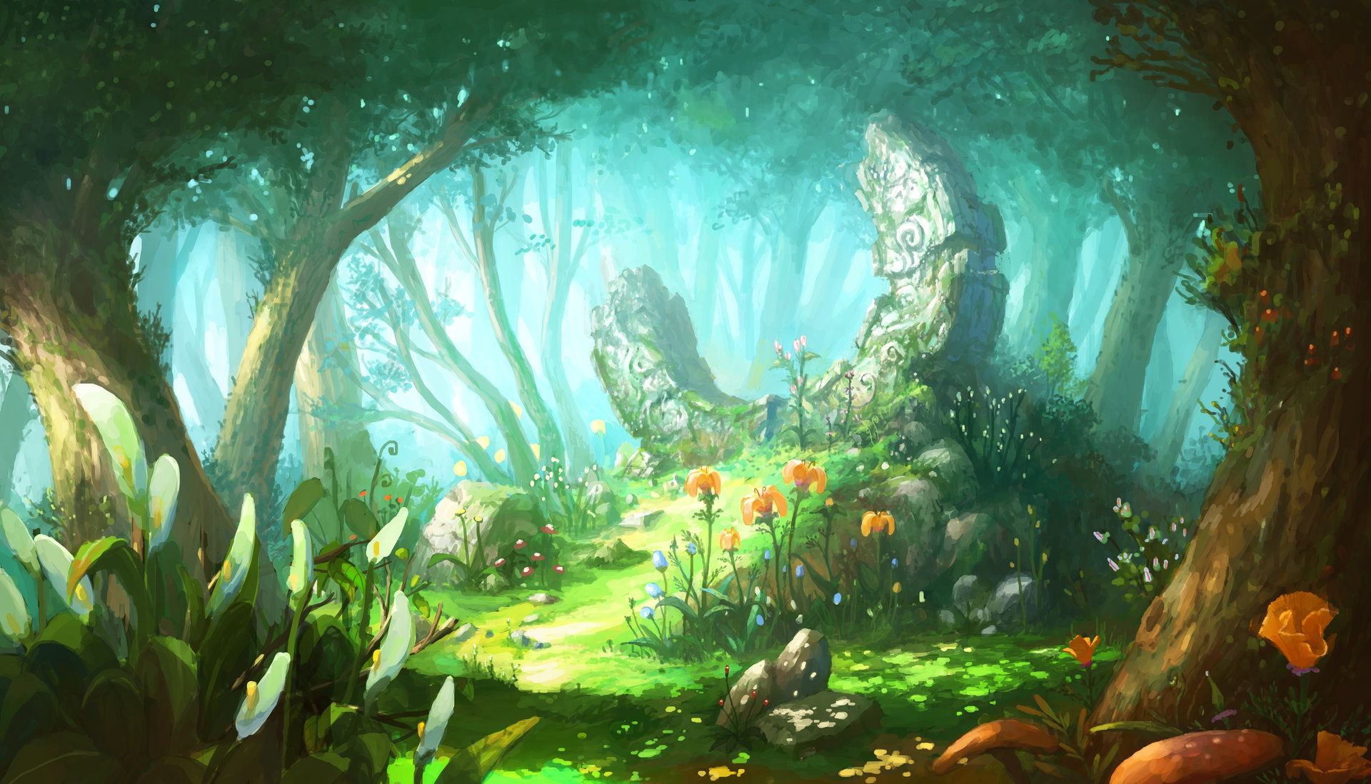
I decided to completely delete the colours from the environment sheet to do this colour overhaul. I applied blue base colour to both the water and the sky, my tutor told me about how the water and the sky merged due to the lack of colour contrast, we looked into how other artists achieve a contrast or create difference with the water and the sky, the two main ways they did this is texture and colour. We are focusing more on colour here. I got around this buy adding a white to blue gradient with some greyish blue water to make them both stand on their own. I think adding the gradient in really showed me that to gain a better understanding of how my scene could look, a bit of gradients really helped me understand the tones in the scene a lot more so I think they worked really well! I made sure to up how rich and lush the greens were (I made sure to add in leaves to the top of the page), I also made sure to paint in some greens to the rocks as if moss is growing from them. The scene looked really fresh but a little cold so I made the light rays a little yellow to balance it out.
I am really happy with how this scene turned out overall. I think the colours work well together and the feedback from my tutor really helped me understand where to go when I was stuck. I have decided that this will be my final colour idea due to how nicely it works and looks. I can now say my environment is complete and I can now move onto my creature designs.

- What did I find difficult or easy?
What I found difficult:
I really struggled to pick an idea that I liked since I couldn’t identify the issues with colour I was having at first so I couldn’t move on and I ended up falling behind a little. I ending up dwelling since none of the colour schemes were working, I wish I got tutor feedback sooner since I just delayed it and went towards peers who were saying they liked the darker colours which is all good but it wasn’t constructive and they didn’t say why they liked these ones when they didn’t sit with me so I was just stuck, I got around this by asking my tutor for help.
What I found easy:
I found sketching out the environments surprisingly easy! I didn’t have problems with perspective or adding tone into the scenes. I worked grey scale to understand the shadow better and to be colour fluid so I wasn’t bias design wise. I thought this would be tricky to do since I haven’t really done this before but I think it turned out well!
- What tasks didn’t I complete from this week?
So I am actually where I’m meant to be (with the finished environment so I’m happy about that) however I did struggle at times to keep up with where I want to be. I have little over a week to do my creature design (Which includes a dragon, three tree creatures and 5 mini woodland animals) so I have lots to do over the next week.
Planning for next week –
- How do I plan to catch up? Do I need to change anything about my work or planning?
I’m planning to pullout every shortcut and quick way of working I know of in photoshop that I have used in my projects. I will be spending more time at home doing practical work (Rather than just my annotations since I’ve spent the last week redoing annotations which has taken a lot of time). I am sure I will pull through within the week but I will need to work like crazy, thankfully the plant test pieces can be reused for the creature design so that saves me loads of time!
Week Number & Date: Week 5: 11.03.20 – 18.03.20
List of Tasks planned for this week:
- Start and finish all dragon and creature design, this includes Dragon, three tree creature variants and five small woodland creatures.
- Workflow will include silhouetting, sketching, colour ideas and shape breakdowns.
Current Position –
- What did I do this week and why did I do it? (Screenshots/Videos/Photos)#
To start off I dived straight into designing the dragon, I began by doing some initial sketches to get me into the flow of things and to help me understand and visualise on paper what it is I would like to achieve. (Similar to what I did with the leaves, flowers and mushrooms). The difference was that I was taking those leaves and flowers and branches and incorporating it into a creature design. I found layering up the leaves and adding all of the plant elements to the dragon base I made surprisingly easy (I may use this way of working digitally later).
I began by working on an initial design in pen traditionally to get started. I would have started digitally but I have been very ill this week so my mum took my laptop away to stop me from working, so it’s traditional designs for now. I loved how the overall idea and design turned out with the layering of all of the wood, leaves and flowers however this issue I had with the creature overall was how cute he looked shape wise. Shape language and structure can say a lot about a character or creature when done right, I was imagining a dragon that was grand and something that could protect a forest from evil tree creatures. While I think the dragon looks cute and I like him overall I don’t feel that he shows this, he so a bit too small, stumpy, chubby and cute (Like my dogs).

I decided to take a step back to understand shape language and structure in dragon design, I took some images from my dragons mood board to use. I used an image of Spyro the dragon from the Reignited trilogy to map out shape language for the character. I drew out basic shapes to break down the structure to understand how the character is broken down, Spryo is a cute character so we can see a range of rounded shapes, the main two are circles and cylinders for the body and head, this gives off a small and cute body shape for the character. While Spyro is strong with his strength but he is still cute in physical design which isn’t what I want personally.

I decided to take another image from the mood board, this time it was of a larger and threatening dragon so that way I could break it down the same way and compare them to Spyro. This dragon is visually a lot more aggressive and grand, when looking at the shapes they are longer and a lot more sharp. I would like to have a softness to my dragon but I would like them to be a lot more grander than they already are since they just look a little stumpy. I have a better understanding over what I need to do to achieve the desired look.

So after doing that quick exercise that I found really helpful I moved onto the second dragon design, I considered the longer and more refined shapes like what I discovered in my exercise and I think this really helped make the dragon look a lot more grand. The neck is a lot longer along with a more triangular face which makes the dragon look a lot more threatening overall which I really like and I think this really fixed the issue of the dragon being way too cute and stumpy.
As for the design, this one features leaves, flowers, and a crown made from branches. The dragon design has a layer of leaves going down the head, back and tail. To break down all of the green I added in an underbelly of flowers and petals. I like the overall shape in this design since they make the dragon look a lot more grand and threatening. My main issue however with this design is the crown made of branches. I added it in to add some form of visual authority but it just ended up looking a little silly. It just looks silly and a bit too much for me.

I moved onto the next idea, I used the same shape language to give the dragon that grand and threatening look and it worked well again shape wise. With this design I think it all works really well with the leaves and branches on the back. I added more leaves than I did in the last two design, in a way they’re draping down which gives it quite an elegant look which I really like. The underbelly is thin, layered up wood to break up the leaves. Idea two just seemed a little too much texture wise with the flowers and leaves all over the dragon so I think the underbelly made with the wood breaks up the work in a really nice way. I would have made the horns bigger but the page wasn’t big enough sadly so I couldn’t fit more onto the page.

While I didn’t like the overwhelming textures of idea two I feel that it may be like that due to the two different textures of the flowers and the leaves clashed and made the whole dragon design overwhelming because of this. I wanted to see what the dragon would look like with a leaf underbelly in case it looked any better. Sadly I don’t think this was the case since the leaves altogether across the whole body just doesn’t look right to me personally. It just looks boring and overwhelming since it’s just leaves with nothing breaking it up! It all just look’s the same.
I do however love the curled horns (This is something I think I would really like in the final dragon design). I really like the branches curling round the dragons legs, I think they’re really elegant and add something really fancy and flowing to the design since they feed into the legs and I really like that.

I moved onto another design, I wanted to try something different this time around since all of the other dragons were leave based. I decided to see what a dragon would look like if it was wood based. I think overall the idea of wood is interesting since it’s another way of creating scales. Colour wise I think it would just look a little bland since there aren’t nearly as many leaves and flowers here so it just looks a little boring. I love the horns but other than that I just don’t really like this design, I am however glad I looked into this design idea so that I could see what it would be like on paper!

In the end I have gone with idea two for a number reasons, I love the draped leaves with the wood underbelly and flowers. As well as this I love the horns and branches coming from the dragons back. I think it’s all balanced out really nicely design wise overall. Of course when drawing out the final product I’ll see what larger horns will look like. But I think this idea is just the best.
So usually I would go straight onto colour ideas as I go however I can’t do this at the moment since I am ill and my mum has taken my laptop from me to make sure I can’t do work. I decided to just move onto my tree creatures traditionally to make sure I can get as much as I can done in as little time as possible so I don’t fall behind!
So with the tree creatures I was a little worried since I’ve never actually done anything like this before so rather than jumping straight into the designing I did some face structure and initial sketches to figure out what it is I need to do. I drew out a basic face structure to work from. Feedback from my tutor a while ago advised me to look into doing different types of face shapes to make my designs interesting and different from one another. I gave this initial face a long and flat nose with a curled up mouth. I think he looks quite sly and mean which I really like.
I also had a quick test on how the neck and shoulders will look like. I decided to make the bark patterns look like bone structure of a human. I think this turned out really well and gave the sketch an eerie human vibe when the bone structure was added in, I really like it and it’s going better than I thought it would design wise.

I felt a lot more confident in this part of the project after the first few initial sketches so I went ahead and did a full design of this guy. I really want my tree creatures to have unique features both in the face and body. I decided to really exaggerate the foot size, length of the limbs to make them look a little creepy and like branches in a way. I think the overexaggerated body has worked really well here in making a unique and creepy design. I made the shoulders a little rounded to make the transition between the arms and body a little smoother.

Because I had been ill the last week all of my work was traditional, I am now feeling much better now so I got my laptop back, I can now do digital work! I carried on with my tree creatures but digitally, because of this I can have a cleaner product and I am able to alter proportions and elements easily.
With the second design I took a similar approach to my first design, skinny body, facial hair and long limbs. While it seems like I have created a quirky formula for my designs the novelty of this type of tree creature had worn off and and to me he looked rather boring. I remembered the feedback my tutor had given me about face design and I decided to apply that same knowledge to the body types. Overall I really didn’t like the design due to how similar her was to the first design, he just looked rather boring because of this. I decided to take what I thought with my next designs and make sure my designs are unique from eachother and aren’t boring. It didn’t work here but I can use what I have learnt to better my designs!

Taking what I learnt I decided to make my third design using rounded and square shapes. The other two designs I have done are quite skinny so I decided to try out a more stumpy design here. To match the body shape I gave him rounded features including his eyes, mouth and nose. Because he is quite short I thought it would be interesting for him to drag his long arms along the floor to make him seem even smaller. I think it gives him a really unique look and in a way it’s quite funny. I gave him branch eye brows so that way I can incorporate leaves into his design to break up the bark since he doesn’t have facial hair.
As well as this I added mushrooms growing from his arms and underarms to add a little more to his design since plain bark looked a little boring. I think it added a lot of character to the design and it looked really nice and quirky to me! So far this is probably my favourite design due to how unique the face shapes and body design is. The feedback from my tutor really helped me out with the face and body shape and I have made a really interesting design, I thought this wouldn’t turn out well but the risk and new way of thinking about design has really paid off!
I took the way I was thinking about my designs and applied this to my next design, I decided to try out a muscular build with a unique face and long arms. I wanted this design to look a lot more threatening since the last few I have done just look like they aren’t a huge threat (Although I do like their designs regardless). I made this characters face a lot more meatier, I’ve built up the brow with bark here. To make him look a lot more threatening I did alter the brow by lowering it a few times to make this design look a little more menacing. I built up the nose to match the structure of the brows, I decided to put the nose a little over the mouth to exaggerate the facial feature here. I made the mouth a lot shaper in this design compared to others, I added in these teeth like shapes to the edges to add an edge to the design (pun not intended). I really liked how this small detail made the creature look a lot more aggressive here, it’s really interesting how that worked out here. I added mushrooms and leaves allover the creatures body to break up the bark, I decided to leave a little more bark showing compared to the previous two to make it a little different and I think it turned out nicely here and made the design a little more meatier and threatening.

I decided to go back to the skinny body shape this time to play around with it again just incase this design pops out. I had a few ideas I wanted to try out since I thought they were interested, I really wanted to mould the mouth out of leaves and create an aggressive tooth line, along with this I wanted to layer up leaves around the shoulder area as well as add vines growing around the limbs.
While the ideas in my head sounded really good I don’t think they turned out well in this design, I think it all looks quite clumsy and bashed together, I just don’t think it looks that great here sadly, I don’t think I’ll be choosing this design since I just don’t feel it works at all, like I said it just feels mushed together which is a bit sad since I was really interested in a lot of these elements.

I have decided to go and choose the designs of the tree creatures dinner date style, there are five of them and I will short list three of them to be the final designs.
I decided to choose ideas one, three and four, I will break down why I picked each idea; I picked idea one because I really liked how lanky and overexaggerated the design was, the long limbs made the design look a little creepy. I also loved the facial hair, I thought it was really quirk and gave the design a lot of personality.
I chose idea two because I really liked the overall body and facial shapes, I am really happy I pushed myself here with different faces and body shapes since this risk really paid off for me! I really like how the hands are dragging across the floor, I think it shows how stumpy and short this creature is and I think the branch eyebrows are really nice.
I chose idea three because I found the meatier design with all the bark built up really interesting and it wasn’t something I saw in any of my other designs. As well as this I really liked the built up face structure here as well, I think it makes the creature look a lot more aggressive against the over two which I really find interesting, almost like he is more of a lead compared to the others.


I went straight into the tree colour ideas, because I have been ill this last week my work flow is a bit out of whack so the first set of colour ideas I did was for tree idea three. Because I did this sketch of him digitally it was really easy to just duplicate six across a page for the colours. I made sure the colours were natural but I also made sure that the colours were broad and unique from one another.
I really like the top left and middle along with the bottom left and right. I like the tones of the colours since they don’t hurt my eyes and all had really natural palettes. I actually really liked the bottom middle however my issue was the green, it was really unique but I didn’t think it sat well on the tree. As for the top right the oak colour was too saturated and I just don’t think it suited my tree design in general.
If I had to pick my two favourite it would have to be the top middle and top left due to how natural the palettes are, I also really like the bottom left however the reason I am put off that one is because I feel that it is too dark and doesn’t suit this tree creature specifically.
In the end I went with the top left idea because I really liked the colour combination and the tones used in the design, I think it fits really well with the shapes and design of the character.

I moved onto the third design I chose and did six colour ideas again, some of the colour ideas were quite similar to the ideas for the first set of colour idea. I tried a range of light and dark palettes for the range so that I could so what everything looked like. The one I experimented a lot with was the top right, I think it was good to see what it would look like but I personally don’t feel that it works on a tree creature due to how unnatural it is.
I really liked the top idle and bottom right due to the fact that they really suited the design, I also liked the bottom middle however it is too similar to the colour idea I chose for the first colour set. Something I also noticed was that the bottom middle also looked quite similar to the first colour idea I chose. This narrowed down my idea to the top middle, I think these darker colours made this design even more threatening and aggressive which I thought really worked well with the design itself. So I have chosen the top middle for this design.

I am now onto the final tree creature design, I did six again here. I played around with warm, cool light and dark palettes again here to see what would work best. With the first three I did a regular tinted design, a warmer one and one with a yellowish tint. These ones were lighter than the last three.
Out of all of these my favourite would have to be the middle due to the warmth of the design, I think it suits the design a lot! I also like the right handed design but I feel that it’s a little boring. The far left one is really boring and nothing really appeals to me there.

With these bottom three I decided to try out some darker colours; The left handed one had a faint blue tint to it with some darker tones. I went a little overboard with the tint of red for the bark and leaves since I wanted to achieve something like the top middle, I’m really mixed since I like the red tint but I don’t think it goes with the design very well, as well as this it wouldn’t fit against the other two. The final one had no tint but a desaturated palette. I’m not too keen on any of the bottom palettes.
In the end I went with the top middle since I thought the colour went really well with the design and I thought it would fit with the other two, the rest of the colours didn’t do it for me.

I moved straight onto the dragon colour ideas, I knew I wanted something Spring/Summer based colour and theme wise so this would need to include lots of rich greens. I started off with a light green here, as you can see there isn’t a massive range of colours in the leaves which is why I don’t really like this colour idea a huge amount. I don’t feel that the brown face against the cream underbelly works well, I think both the face and the underbelly need to be the same shade and colour so it looks good. In my next colour ideas I am going to use a larger range of colours for the dragon coat wise.

- What did I find difficult or easy?
What I found difficult:
- I found it really tricky keeping up to date due to how sick I have been the last week, I really struggled to work and write so I have fallen quite behind, we do however have a week extension so I will make sure I an get all my work done next week.
What I found easy:
- I found working traditionally in bed a lot easier when I was ill, I was able to get my initial work done which was good, although it did mess up me work flow a but I think it turned out well.
- What tasks didn’t I complete from this week?
So like I said I am behind a little, I was meant to have everything done however I still need to do the dragon colour palette and the woodland create designs. I’ve fallen behind due to sickness and due to the situation at college with it shutting we have an extra week so I am happy about that.
Planning for next week –
- How do I plan to catch up? Do I need to change anything about my work or planning?
So I need to do dragon colour ideas, these will take less than a day like my tree colour ideas (All three sets took a day), the tree designs overall took 2 days altogether so I do genuinely feel that I will be able to do this okay. will however need to be productive and active and make sure I don’t fall behind in blog work.
Week Number & Date: Week 4: 11.03.20-18.03.20
List of Tasks planned for this week:
- Review proposal time table and reflect on how I have kept up so far with my work, do I need to change anything, am I doing okay with my workflow?
- Finish off dragon colour ideas and woodland creature designs and colour ideas.
Current Position –
This may seem like a bit of a surprise however we asked to evaluate how we are doing with our work flow compared to our proposed timetable and we need to evaluate it to see if we need to change anything at all about our way of working.
So overall we are week 5 (And with our production work we are week 6), if you look at the time table and compare it to where I am now I am one week behind, however due to illness and the coronavirus effecting college we now have a week extra to do work (Which does in fact work in our favour)! I do however think I need to carry on being motivated at home the way I have been so far and carry on working at the pace I am. I will however say that I should work on my blog bit by bit rather than in bulk since that can cause burnout which isn’t nice to experience. This is my proposed time table so you can have a look at where I am. It’s all good for now.


With the evaluation done it’s back to dragon colour ideas, I took the need to add more tones in the leaves, I think it really broke up the coat and added in loads of variety, the design looked a lot more exciting this way. As well as this I made the face the same colour as the underbelly to keep it all consistent. I think this is a really good step forward however it all seems a little boring, the flowers are white here so they don’t really stand out. I will consider this in my next design.

For the next design I gave the dragon a blueish tint along with pink flowers to create a contrast and make the dragon seem a little more colourful. I wasn’t sure about how this design would look when I was creating this one due to the blue tint since I got worried it would take away the Spring feel and replace it with a Wintery one instead. I was actually pleasantly surprised when I saw the outcome of this one, it had a very calming appearance to it and the colours looked really lush since they were a little darker. I also really like how the pink flowers turned out against the coat, I think they contrasted really nicely here.

I decided to try out a more yellowish tint this time with white flowers. I tried yellow so it looked like the leaves you get at the very start of Autumn. I know in my proposal I talked about having it all Spring based but I wanted to try different palettes just in case. I think the white flowers look nice against it all but I think the coat just looks bland and in a way dead now because of the desaturtated yellows. In a way this is what I wanted with this design but I just don’t think it worked out very well here. I am happy I tried this palette however since I now know if it would have worked.

I decided I wanted to try one more Autumn palette just in case, I made this one a little more saturated and red since my issue with the previous palette was that it was bland and a little too desaturated. I still don’t think this Autumn palette sits well with the design, I don’t think the Autumn theme really works well with this actual design in general since the design is very fresh and Springy wih the flowers, new leaves and curving branches. I have decided I am just going to stick with the Spring/Summer palette.

With the Spring/Summer palette back in mind I decided to revisit idea two, an issue I had with idea two was that it was too light, I really liked how lush idea three was so I decided to darken the palette here to see if it woud have the same effect here as it did with idea three. I think in a way it has but I don’t think it looks as good as idea three sadly. All of the colour ideas I have done are just lacking something (Apart from idea three), I really wasn’t sure what I was meant to do with these colours since I was so stuck. I did end up booking a 1-1 with my art tutor to help me out.

During the 1-1 with my tutor I discussed how I was really struggling with my colour ideas and how I really didn’t know what to choose or where to go if I wanted to do more ideas. My tutor took a liking to idea three due to the contrast of the flowers and the lushness of the greens but she talked about how something was missing.
She told me about how showing transition in the leaves would be really interesting in the design colour wise. She sent me some images on pinterest by an artist called Alvia, the artist colours all of their creatures with colour transitions, I really liked how this looked and I thought it would look really nice in my design.

I decided to try and create the gradient from a lush green to a light blue, while it looked interesting the issue my tutor brought up was how the variation in the tones in the leaves were now gone which was a shame since the variation looked really good.

To get around this issue I redid the gradient on a different layer and put the layer mode onto overlay so that the variation can still be seen. This version looked a lot better due to the transition and variations.

My tutor came up with another idea for the transitions colour wise. She talked about how I could have an Autumn gradient coming from the bottom of the tail. At first I really wasn’t sure if it would work since my Autumn colour ideas didn’t really work.
To help me visualise it my tutor gave me two examples of some photobashes using my other colour ideas to give me a general idea. I was given two examples, one had just an orange gradient and the second one had a red to orange gradient at the bottom. The colours turned out way better than I thought it would and really convinced me to give this look an actual go with the gradients.


As well as trying out the Autumn palette at the bottom I made the top of the head a little darker so that it goes into a lighter green and then orange to red, I think it turned out really well this way. I am however still a bit conflicted with this colour design and the green to blue gradients. I really like both of them and I got worried the multicoloured gradient would look too much.

I decided to go onto the college Discord to get some feedback on these two colour ideas. I just couldn’t choose myself and I needed reassurance that the multicoloured design looked nice. Everyone said the multicoloured design was the nicest of the two which in a way made me quite happy, I looked bac at the two designs after this and realised the multicoloured design did look really nice. The 1-1 really helped me get out of the colour idea hole I was stuck in and the feedback chat really helped me decide and realise which of the two was the best.

Because of the interesting colours, gradient and the tones in the leaves I have decided this colour idea will be the final overall dragon design. I am really happy that I finally picked the colour idea that was best and that I have managed to get out of the hole I was stuck in.
Now that the dragon is done I can now move onto the final part of the ideas generation: The woodland creatures. I’ve actually been really excited for this part of the fmp since there is so much I can do with this part. I will be doing five woodland creatures for this part, the creatures will include:
- A rabbit
- An owl
- A fox
- A raccoon
- A hedgehog
I decided to start off with the rabbit sine that was the first creature on my list. The way I drew out and designed the rabbits was by drawing a base using universal shapes (Circles, squares, triangles) and drawing all of the flowers and leaves over the base. I tried out a range of things here like small twigs coming from the leaves, ears that point up along with a flower based tail.
I really like the first design due to the fact that he’s a little chubby (which makes him really cute I think) and I think all the elements of the design really look good together. I decided to try out the design with floppy ears to see how that would look, I think it actually made the rabbit look sad in this design, I don’t think it translated well here. I ill however keep trying the floppy ears for other designs.

This first sketch on the top of the page is the same design from the previous page but with some more ear exploration.
The bottom design was a new one I did for the rabbit, I tried out the floppy ears this time and added some flowers on the top of the head. I really liked how this design turned out, I think its really cute and overall the design works really well.

My tutor talked about me giving the rabbit with the tulip design a chubbier body like the first design, I think the body type is cute but I personally don’t think it suits the design as a whole. I think because the designs are so specific it’s tricky to make them work in different body forms. I moved onto another design, this time I removed the tulip ears and replaced them with a flower crown. I think this design is really really cute and it suits it’s body shape.

My tutor suggested making the rabbit chubbier like the first and giving the rabbit a tulip tail instead in the discord feedback chat.

I followed my tutors advice and the rabbit turned out nicely, the design fits well with the body shape and the tulip works nicely with the other flowers as well. This is the final design I am going with since it’s a combination of all of the elements of the other designs that work well. I am really happy with this design because of that.

Now that the design is sorted I can now move onto colour ideas, The colours are all quite similar however they are all different greens with different coloured flowers, different colour tints on the leaves. I really like the top middle colour idea along with the bottom left and right. I wasn’t sure about the top right since I don’t think the yellowish tint works well and the top left design just looks a bit boring and dark.
I liked the Autumn palette at the bottom however I don’t think it would work with the rabbit, I think it would work on other animals like the fox and owl but not here.
The bottom left is similar to the top middle. The difference is that there isn’t as much of a blue tint here, I really like how the coral flowers look against the green along with the vibrance of the green here. I like the bottom right but not as much, I like the fact that it’s a little lighter than the top left design but I just feel that it’s still a little boring.
Because of all of these factors I have gone with the bottom left as my final design, I like the lushness of the green and I think the coral flowers are really unique and suit the tulip tail! I would have gone with the top middle but I think the tint was a bit too much there!

The next creature I decided to work n was the fox. I think out of all of the designs this was the one I was least excited about (Although I love foxes) since I wasn’t that sure on how I would be able to do the design. I think looking back at the design it turned out better than I thought it would but I did find the design a little tricky.
Like the rabbit design I broke down the base in shapes to draw all the leaves and flowers over the base. I actually thought using an Autumn palette and theme would work for the fox since they have warm palettes in real life, I got this idea from the failed rabbit idea. I decided to put mushrooms and acorns into the design to add to that Autumn theme and I think it turned out really well.
I decided to try and add more mushrooms to the second design, I thought this would have turned out well but it just ended up looking too much to me here. My tutor told me about trying different leaf types for the others. Due to this being initial sketches it’s not something I can really do however due to the stamp technique I plan to use this will be doable in the final product.

I found an image on pinterest of a very interesting type of berry, I thought this berry would look really interesting on the fox design.

I decided to try designing the fox with these berries. I think the berries looked way too much on the fox design, it looked really busy and overwhelming I think. My tutor did recommend trying less berries so I revisited this design after the next one.

I decided to use some long leaves that all connect to one another this time, I have seen a lot of these types of leaves in Autumn based photos I thought it would look really nice with some mushrooms and nuts in the design. Once again I think it looks too much and too busy here.
I decided revisit the berry design, I added less here this time and while I think this worked better I still feel that it didn’t work incredibly well here. It just doesn’t sit right on the fox design and without other things like mushrooms it looks too much.

I think out of all of these designs the first one was the best because it had a balance of everything here, it looked really Autumn themed and it worked well with the foxes design.

I then moved onto the colour ideas, most of the designs were Autumn based since that is what I focused my design on, however I did try some Spring designs just in case.
Out of all of them I really like all of the Autumn themed ones, the Spring ones don’t interest me at all here since they don’t suit the fox design, I think the bottom left is way too yellow and the bottom right is too bland. I think my favourite colour ideas are the top left and bottom middle, I like the vibrance of the two, I think the top left is a little too light for me.
From narrowing all the colours down I have gone with the bottom middle due to the vibrance and Autumn palette! It was really easy picking out a colour palette for this fox design compared to the rabbit ideas.

I moved onto the owl, I haven’t worked with birds art wise for a while so I was excited about this one. I saw quite a few images of owls with interesting eyebrows so I thought this would be good since I could used leaves or grass to make the brows. The owls all look normal here since the leaves are the same shape as feathers so they just look like normal owls here, because of this I considered using flowers to break this all up in my designs. I think my favourite out of these first three designs is the first on due to the brows. I would really like to include them in the final design.
I really liked the flowers on the bottom rights design, I think the owl looks cute but he’s not my favourite since there are no eyebrows.

I made sure to include flowers in the next two designs since I really liked how they broke up the previous design. I tried out an owl with leads of feather and flowers to see if that would make up for the lack of brows, for me personally I didn’t think the design was that interesting without the really quirky brows.
I actually went back and revisited the first design with the quirky rows, like I said I think the flowers break up the leaves nicely so I added flowers to this design. I really like how this design turned out in the end, I have decided the revisited design will be the final one due to how it incorporated different elements I liked from previous designs.

I decided to do a mix of different colours, this design actually has a bit of wood in it (on the chest) so I decided to do three brown palettes and three green palettes, I think they all look really good which is going to be hard to choose between, owls often have naturally brown palettes in real life so I think it would be really nice to have one of the brown palettes. Although the greens look really nice the brown palette would be good for the owl due to the natural palette.
I have to narrow down one of these three designs, I really like the bottom right due to how rich the red it, although I feel like it may be a little too much overall. I liked the top middle a lot since the brown is quite natural however when compared to the top right I prefer the top right due to the fact it is a mix of the previous two. As well as this I think the blue flowers really added something special to the design. I decided the top right was the best since it was a mix of the other two I liked and the blue flowers were really nice.

I moved onto the raccoon, I’ve been really excited about this creature since I personally really like raccoons. I used reference of raccoons to see where the darker tones are in the face and tail so that I would know where the different tones would go.
With the first design it is just leaves, I personally don’t think this turned out very well since there is nothing to break up the leaves like flowers and mushrooms. I really like the overall way this raccoon has been drawn but I think some extra things like mushrooms and flowers would have really broken up the design nicely.

I decided to add flowers into the next design, I made the ears into flowers which I really like, I liked how the leaves looked a lot more fluffy in this design compared to the last design. I liked how cute the raccoon looked although I think some mushrooms and twigs would look really nice too!

I took the idea of giving the raccoon some mushrooms and twigs, I think this made the raccoon look a lot more messy which matches the nature of raccoons in real life. This also gave me the idea of using an Autumn palette like the fox in this design to match the real life animal. I thought the design looked a little too messy however so I cleaned it up in the next design.
I really like how the bottom design looked since it has all f the mushrooms and flowers to give it a bit of a messy look but the design is still readable and clean. I have chosen this design as my final design due to how it cleans up the previous design and keeps all of the elements I really like.

I then moved onto the colour ideas for this creature. Like the fox I wanted an Autumn palette but I am trying the Spring palettes just in case. The two palettes I really don’t like are the bottom middle and right due to how over saturated they are, I don’t think it works well with balancing the darker tones in the leaves. I’m also not sure about the top right due to the yellow tint. The three colours I do like are the top left and middle along with the bottom left due to hoe they all balance the dark and light tones in the colour.
I really like the funky mushrooms and leaves in the bottom left design but I feel that they are too funky and distracting design wise although this could be a good thing and add something unique to the raccoons design. With the top middle the green still feels too much overall and I think I really want that Autumn palette to match the real life raccoons. It’s now between the top and bottom left. I am really tempted to go for the top left since it’s safe but I took a risk colour wise with the dragon so I really want to go with the bottom left now. I think the bottom left is really nice and unique and I think it really suits the raccoon design overall.

I am now on the final creature: The hedgehog. This is probably my favourite creature out of the bunch and I have been really excited to do this one since I love hedgehogs so much. I had two big design ideas in my head for this one, the two being twigs as spikes or leaves and flowers as the spikes. I have a lot of places I can go with this creature which makes me excited.
I started off with a leaf and flower design first, I made the hedgehog a little extra chubby like the rabbit to give him a really cute look. Like the other rabbit and owl design I used the flowers to break up the leaves here. Along with this the feet are made from wood. I really liked how this design turned out since it’s been balanced nicely.

I moved onto design two after the first one, for this design I used the twig idea I had for the spikes. A worry I did have then I thought about the twigs was how I would break up the twigs design wise, too much of anything would look like too much visually which has been a problem for me a few times design wise. I broke up the twigs by adding flowers and very small leaves at the ends and inbetween all of the twigs, I think this worked out really well, I love how the hedgehog looks in this design, he looks really really cute although I worry that in the final painted version it will look boring due to all of the brown and wood.

I tried another wood based design, I layered up strips of wood that were a little thicker than the previous design and added some small twigs, leaves and some mushrooms. I thought this all looked way too much altogether. I didn’t think it worked because hedgehogs are really small animals so I thought it just looked too much overall. Because of this I went with idea one due to how cute and well balanced the overall design was as a whole.

I moved onto colour ideas, I used both Spring and Autumn palettes like the raccoon design since hedgehogs often have a brownish palette in real life like the raccoon. I like all of these palettes except for the top left since it’s a bit too dark overall. I realised I would have to narrow it down to one Autumn and one Spring palette and work from there since that would be the easiest way to narrow it down.
Out of the two remaining Spring colours that I liked (bottom left and right) it was really hard to pick, however I went with the bottom right so that it wasn’t too similar to the rabbit colour. Out of the three Autumn colours I went with the top right, I thought the colours were really interesting and would make the hedgehog stand out against the raccoon, owl and fox who all have Autumn palettes and themes. The top and bottom middle looked too similar to the previously mentioned animals and I felt that the hedgehog wouldn’t be able to stand on his own with either of those two palettes.
So it was then between the top and bottom right. I really liked both of them however I realised that if the hedgehog had the Autumn palette the rabbit would be all on their own colour wise and the Autumn would look too dominant on the reference sheet I will be doing for the exhibition. Because of this fact I have decided I will be going with the bottom right so that it balances out the Autumn animals. I also think that this Spring palette really suits the hedgehog. With that sorted my ideas generation is now complete so I can now move onto the creation of my final products!

What did I find difficult or easy?:
- What I found difficult:
I found choosing the colour ideas of the dragon really tricky. I was torn between the green to blue gradient and the mixed season gradient. Thankfully I sorted this out since the college discord reassured me that the mixed design was infact the best of the two. I also really struggled with choosing the colours of the woodland creatures along with designing them. Discord helped with this too.
- What I found easy:
I found the actually painting and drawing easy overall since I had my sketches to work from. When I knew what to do with my designs and colour ideas I was able to get into the flow of things and when I knew what I needed to do it was all good for me.
What tasks didn’t I complete from this week?:
I have managed to complete all of my ideas generation this week! Nothing needs to be planned next week for the ideas generation, I can now move onto the final product!
